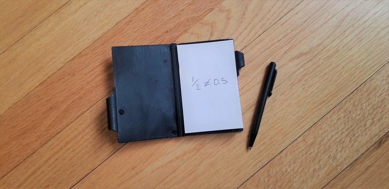
½ is not 0.5
It's just not. I know, sure, mathematically it's the same, but ½ is fundamentally a different thing entirely to 0.5, and really quite confusing. Let me explain.
This all started with some mathematics homework that I was trying to do with my son. We had done some work with fractions, and he had gotten comfortable with doing some addition and subtraction, so ¼ + ½ = ¾ was all fine and good. We had just started with decimals and similarly done 0.25 + 0.5 = 0.75. All was going well, or so I thought.
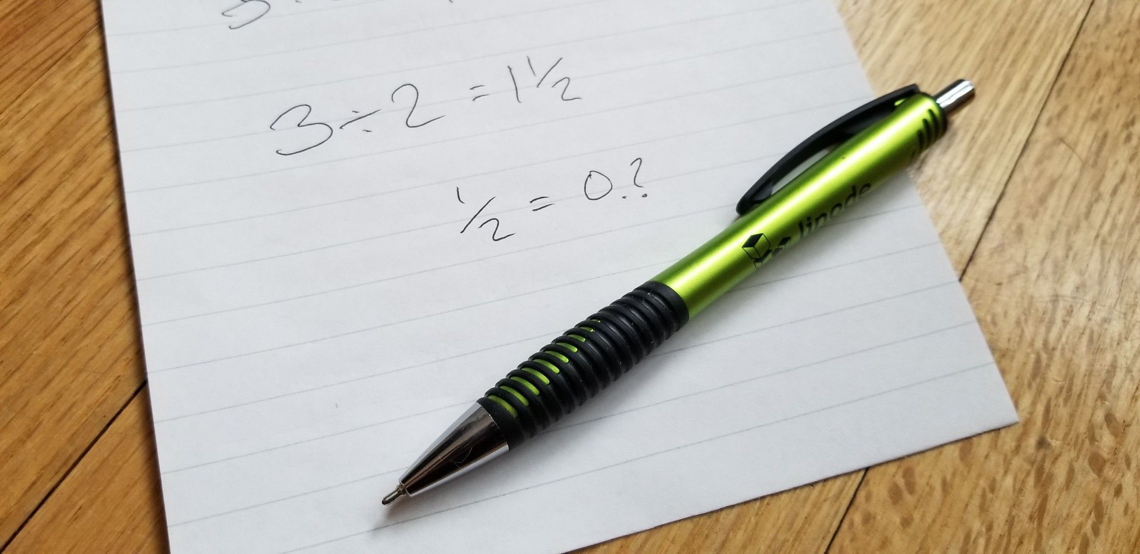
Then I gave him 3 ÷ 2 = ?
Now we've touched on division, but only with integers, and he knew enough that the answer was going to be three cut into two pieces. He reasoned that the answer couldn't be one as that was too small, and two was too big. Soon enough, "the answer is one and a half", and we double checked that multiplying the answer by 2 got us back to 3.
"Great", I said, thinking this was going so well, "now what's one and a half as a decimal?".
Blank looks.
Ok I thought, maybe I had gone a bit too fast, let's make the problem a bit simpler.
"Let's not worry about the 1 for now, what's ½ as a decimal?"
"0.2?" he cautiously answered.
The Problem with Explanation
I was thinking at this point that I had either gone way too fast, or didn't explain things properly, so I tried to explain things again. I went over how you could divide one into ten pieces and how each piece was a tenth, which you could write as 0.1, as half of ten is five then the answer would be 0.5 as that's five times 0.1.
More blank looks.
This wasn't going well at all. I tried explaining that half of one hundred was fifty, so dividing by ten, half of ten was five, and divide by ten again half of one was 0.5.
Even more blank looks.
This was going from bad to worse. I said we'd call it a day and asked him if we could try again tomorrow and by then hopefully his dad had figured out some way to explain this in a way that made sense.
Looking at the Problem Differently
I spent a while looking at the problem:
½ = 0.5
Now I know the answer is right, but even to me it just feels wrong. It looks like very similar to 2 = 5, which we know is wrong, and I'm sure that's why he guessed that the answer was 0.2 to start off with. One chopped into two pieces equals five tenths; the more I looked at it, the less sense it made to me, as each side of the equation represented a totally different concept.
I tried looking up the decimal point online. Whilst I did discover that up until the sixties the Americans and the Europeans couldn't even agree on using a dot or a comma as a decimal place, which lead to the early programming language ALGOL allowing either a dot or a comma, it didn't really help me with any explanation.
I was wondering how on earth I was going to explain this, and then thought, maybe it's not the concept that's the problem, maybe it's just a problem with how it looks. I reached for the pens and paper.
I spent a while looking at the problem, and then I had an idea. I drew some circles and divided them into segments to show the relationship visually:
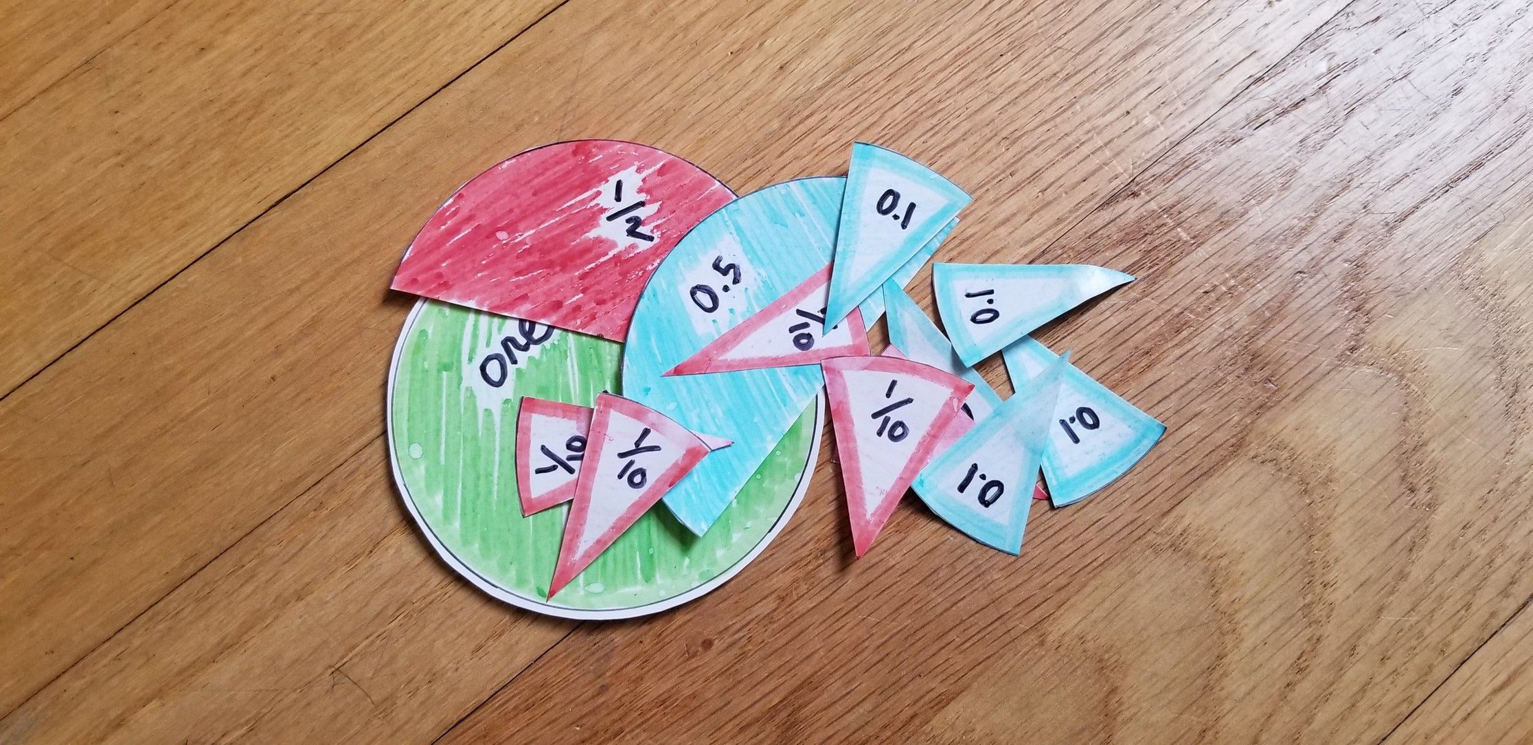
I left this out on the table and busied myself in the kitchen. A short while later I heard some sounds of paper moving, and then from the other room a voice exclaimed:
"I get it now Dad!"
The Real Solution
I didn't have to explain a thing. In fact, my explanations had only made things worse. Rather than trying to explain a problem in ways that didn't make any sense, he had constructed a solution that looked right and made total sense, just by using the pieces in a way that worked for him. No explanation required.
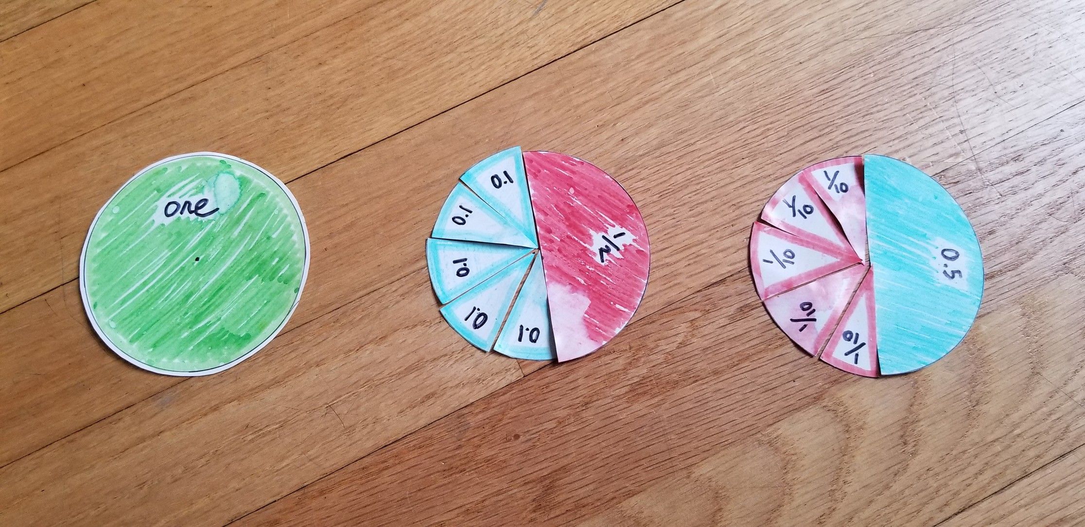
We went on to talk about ¼ = 0.25 by talking about chopping one of the blue 0.1 wedges into ten pieces, and it was easy. I'm not saying that this is the best way to teach fractions and decimals to all schoolkids, but what I am saying is that our brains want to learn and formulate patterns in the way that makes sense to them, and given the right pieces they will do that effortlessly.
The UX Lesson
Or put another way, speaking as a UX designer:
If you have to explain how to use something, you haven't designed it right.
Understanding doesn't come from explaining, it comes from engaging with concepts we can relate to. The visual representation allowed my son to see the relationship between fractions and decimals in a way that made intuitive sense, rather than requiring him to memorize abstract rules.
This principle applies directly to user experience design. When users struggle with an interface, the solution isn't better documentation or more detailed explanations - it's better design that makes the interaction feel natural and obvious.
The best interfaces, like the best teaching tools, work by connecting new concepts to patterns people already understand, transforming the unfamiliar into something that feels natural and intuitive.